Show Me Your Data: The Visual Web in the Kenyan Elections
A special guest post by Phil Brondyke from NDI’s Elections team.
 In the past 18 months, images have re-become the hottest thing online. Pinterest has nearly 10 million unique visitors per month, becoming one of the top ten most trafficked social outlets at the end of 2011. In 2012, Facebook saw some serious value in the mobile photo filtering app Instagram, picking the company up for a cool $1 billion. And everyone has pretty maps. In short, beautiful pictures, infographics, and visual data on the web are hotter than ever.
Enter the Kenyan 2013 presidential elections. The Elections Observation Group (ELOG), NDI's partner, increased its impact by plotting out a way to share the valuable and complex data collected from its massive election observers in a simple way online.
ELOG used an advanced Election Day monitoring methodology, also called a parallel vote tabulation, and explained what that is with a GIF and videos.
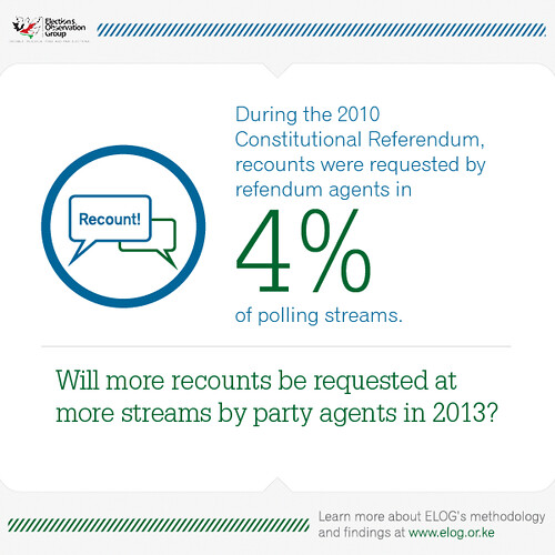
In 2010 ELOG systematically monitored the Kenyan Constitutional Referendum by deploying observers to a random sample of polling stations across the country. The observers rapidly reported their data via SMS back to a central data center so ELOG could evaluate how the election was going in near real-time.
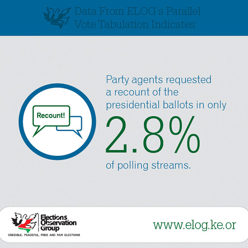
That effort was the trial run for what ELOG would do and collect on election day 2013 - a day much anticipated and worried about after the very violent election debacle in 2008. ELOG analyzed the data following the 2010 poll and created simple sharable infographics that could be uploaded to Facebook and Twitter. The goal of these graphics was to demonstrate that ELOG had--and would be collecting--valuable data and key analysis about the quality of the process. The infographics were mainly targeting political parties and the election commission, but ended up also appealing to a keenly involved Kenyan political digerati.
On election day in every country where there is a systematic observation effort, a considerable amount of data is collected in a very short time. For this to be relevant to the public, actionable information needs to be shared rapidly.
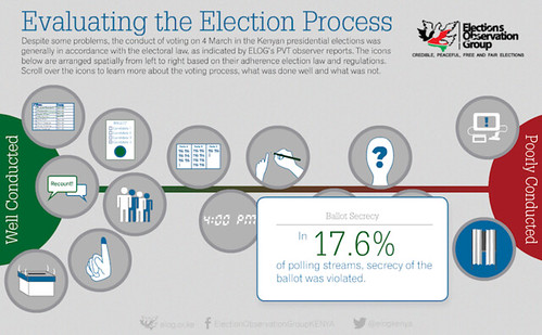
Sharing information that ELOG had previously collected in the form of catchy infographics primed its internet audience election day information. While the infographics were at the heart of ELOG’s social media strategy, the coalition also produced other interactive visualizations that were released on, or immediately after, election day that told the story of the election’s process. One told the story of what went well and what went poorly on election day (i.e., the opening of polls, voting, and the counting of the ballots). With reliable data texted in from its observers, ELOG could visually show the quality of the election day process.
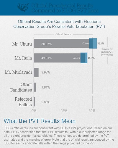
Overall, ELOG's analysis showed that the process went well and that the results of the Presidential Election were credible. However, there were some weak points such as a failure of over half of the electronic polling books and a relatively high percentage of violations of ballot secrecy.
Another interactive visualization showed both the presence of parties agents at polling stations and then what percentage of each party signed the official results form.
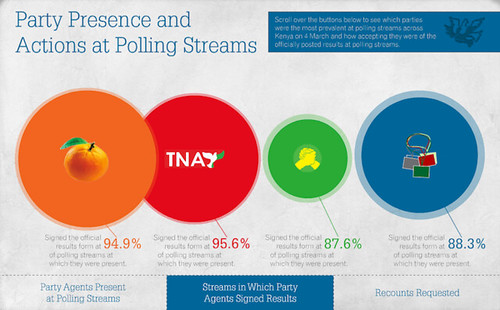
A losing candidate can have a hard time accepting that fact and (rightly or wrongly) claim that the process was flawed. By presenting reliable and stastically significant data in a clear and compelling way, ELOG was able to show that, in fact, party agents from the major parties were present at most of the polling stations, and that they signed the official results form indicating they did not disagree with the results. If party agents are in most of the stations and they agree with the results, then it becomes hard for that party’s candidate to claim the election was flawed after the fact.
There were two big takeaways from ELOG’s communication strategy. First, visual presentation of data works, especially if they are in a format that is easily understood and can be readily shared. People shared and consume original ELOG content in great numbers on Facebook, Twitter, and via printed versions of the ELOG interim and final election day statements.
Second, it is important for citizen organizations that perform systematic election observation emphasize compelling and ideally actionable analysis of data rather than focus on the data itself. Parallel vote tabulations are an complex activity that needs explanation. Organizations conducting systematic election observation need to frame their data in a way that everyone can understand and that is relevant to their target audiences. In much of the election observation work that NDI assists in-country partners with, a scarcity of data is not the issue during an election but rather a scarcity of appealing and digestible, high-quality analysis.
Following the lead of ELOG, we will continue to push our partners to keep thinking visually about their online communications. Tech giants the Internet over have recognized the power of the visual web and there’s no reason we can’t do the same.