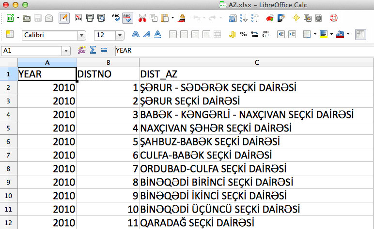
I’ve recently been digging into the useful resource Election Passport - it’s a compilation of constituency-level official election results for over 80 countries around the world.
Having this basic information can be a great asset, particularly as we try and find new ways to provide context for citizens by visualizing and mapping electoral environments. One of the best ways to understand a country can be via a classic political red/blue-state style map as has been routine for elections in the United States. I prefer more shades than just red and blue, of course, to show party preference and intensity of that preference, and it’s certainly more complicated to visualize party preference or election results for multi-party democracies. But such historical data can provide useful context for countries where election law violation incidents might be taking place.
In some countries, regrettably, there’s a hitch. This data all comes from official sources, which is the only good way to do it, but in a number of countries, the election commission is not a source of good data. It’s the old unreliable narrator problem. For example, Ukraine wasn’t exactly riding the free and fair elections train for most of its history as an independent “democracy;” and by using the data, one can be reinforcing illegitimate outcomes by accepting it at face value.
That’s a general problem our partners can face when monitoring elections. As we’ve noted in the past, these days it’s only the amateurs that steal elections at the ballot box. Everything can be calm, peaceful, free and fair on election day - but if the pre-election environment is deeply biased toward one side, then no legitmate outcome can come from it, and reinforcing the results means helping the manipulators get away with it.
That aside, Election Passport is a great dataset and a tremendous service - go play with it. Hats off to David Lubin and his team for pulling it together.

